Boosting User Engagement: Connecting devices to keep users hooked on health
A redesign of the health tracking feature in the Well app


Challenge
Imagine this: You’re trying to build better health habits—tracking your sleep, stress, and activity—but every day, you have to manually log everything. It’s frustrating, tedious, and after a while, you just stop. That’s the reality our users faced with Well’s Check-ins feature.
Tools
Figma, Figjam, LookBack, Miro
Timeline
January - October 2024
My Role
Design Lead: UX/UI
Team
Solo designer, 2 project managers, 4 engineers, 2 delivery
Understanding the problem
Context
Well is a personalized health platform that rewards users for making healthier choices. Its Check-ins feature, launched in early 2023, let users track habits like sleep and stress—but only through manual entry.
🚨 What users struggled with:

"Manual data entry is tedious and inefficient."
Users didn’t want to enter their health data by hand.
"I can’t see all my health data in one place."
There was no centralized dashboard for tracking progress.
💼 What the business needed:
Higher engagement and retention—users weren’t consistently using Check-ins.
More integrations to support Well’s corporate health initiatives.
Discover and Research
~30% | 100 million
of Americans use a wearable device (including smart watches)⌚️
220+ million
Americans already track steps and sleep via Apple Health / Google Fit 🔗
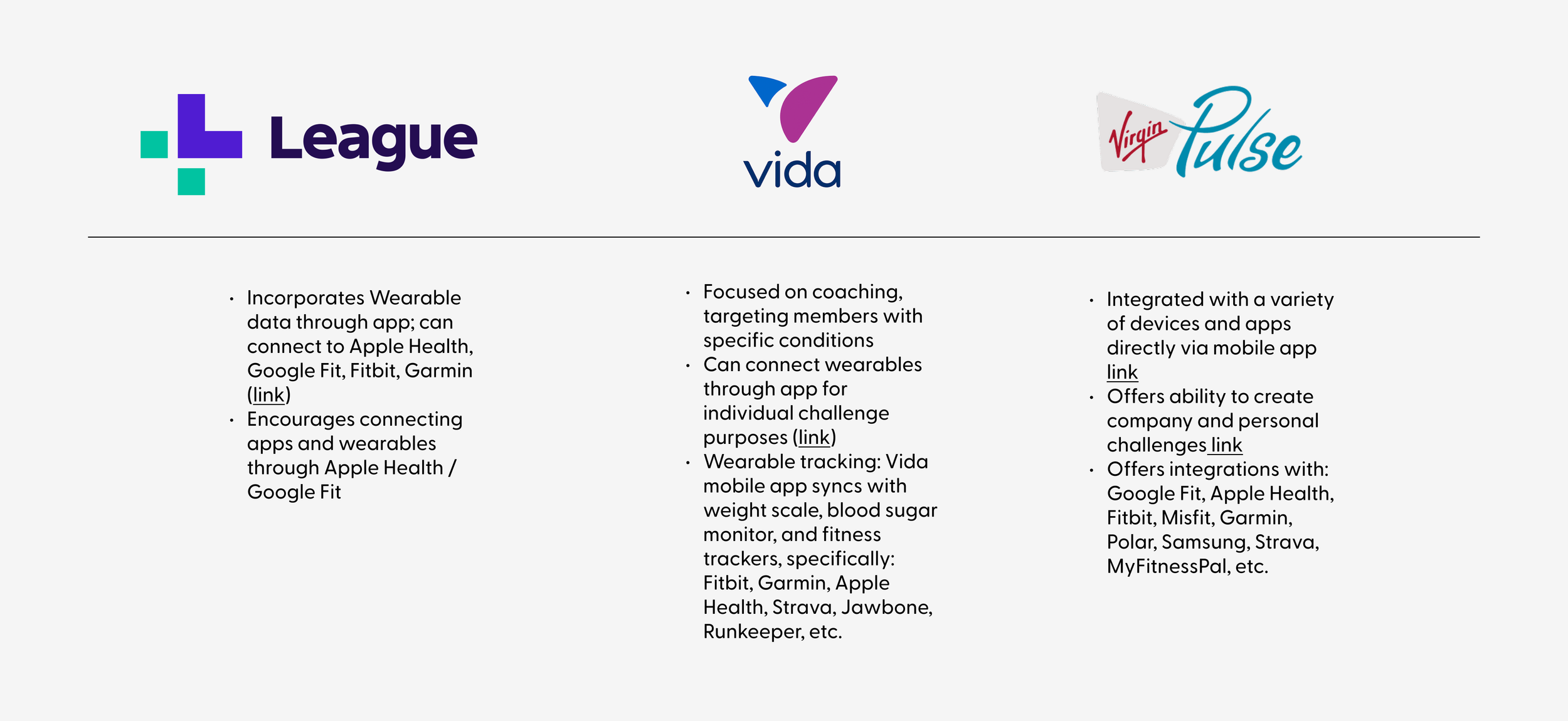
Most competitors in the Wellness market boast support for many device integrations
Competitive landscape
📝 User study: current state evaluation
To get a deeper understanding of the friction points within the Check-ins MVP I conducted a moderated usability study. I recruited 10 participants from a range of ages and backgrounds who, prior to the study, had no familiarity with the brand or platform.

Format
Moderated user test. Participants navigated the live Well production app, performing tasks provided by the test moderator.
🧩 Affinity mapping
I brought my notes and user quotes from the study to an affinity mapping workshop with the rest of the design team. This process helped me uncover common patterns that led to key insights and opportunities.

Tedious data entry: Users found manual data entry cumbersome, especially when compared to automated systems like wearables.
🤔
Dashboard confusion: Users expected to see all entries on the dashboard but were confused by its current structure, where only the most recent entry was visible.
🏆
Craving emotional rewards: Users need emotional rewards & recognition to stay motivated; without them, they lose interest.
Key insights and opportunities
⏳
📊
Seeking progress beyond numbers: A majority of users expressed interest in seeing trends, patterns, and actionable insights from their data.
Defining the solution
With these insights, I then collaborated with stakeholders across the company, including client representatives, to align user needs with business goals.

Ideation
Now that the user needs were aligned with the company KPIs (Key performance indicators) I framed key questions to guide the rest of my design process.
💡 How might we. . .
. . . automate health data collection while keeping users in control?
. . . provide actionable insights beyond just numbers?
. . . encourage long-term engagement with motivational features?
Wireframes


Design
Component UI updates
At the time of this project, the company went through a rebrand. Optimizing Check-ins now involved updating the outdated components and colors and renaming the feature to “MyHealth”

High-fidelity designs
User problem: tedious manual logging
✅ Seamless device integration

Redesigned dashboard and navigation to simplify device connection
A redesigned Apps & Devices screen clearly shows connection status.
Emphasis on syncing first, with manual tracking as a secondary option.
User need: progress beyond numbers
✅ A smarter health dashboard


Visualizing progress, growth and success
Personalized insights visualize trends in sleep, stress, and activity.
Users receive Instant interventions and guidance to other app offerings based on their data.
✅ Gamification


User need: emotional rewards for motivation

5-daily entries reward
Streak system & reward points encourage daily tracking.
Users are incentivized to enter at least five categories per day.
Tracks like mood and stress are manual (despite device connection) and require the user to actively engage
Test
We conducted moderated testing of MyHealth before moving forward to development. We aimed to uncover friction and gauge interest in the updated tracking dashboard.
How seamlessly are people able to integrate apps/devices? Are they eager to sync (and if not, why)?
Do users find the dashboard aligns with their specific health tracking needs?
Are users eager to enter their “5-entries-per-day” for rewards? How motivating does this seem?
Can users tell that manual tracking is available (along with syncing from other apps/devices)?
🧩 Affinity mapping
After the interviews I held a workshop where we grouped the user quotes to highlight themes and opportunities.

💙 What worked well
Users acclimated to the dashboard right away: It was easy to gather context for what MyHealth is + how it can be used
Positive interest in the dashboard as a single view for recent data: “I like how it’s all put together here” - user quote
Most testers noted appreciation for mental and physical wellness in the same view: This felt different from other products they’ve tried
Opportunities
🚨MVP / tactical
Address “banner blindness” (connect cta / integration flow)
Shuffle terminology in the activity health focus area (especially “fitness”)
Explore options to orient users around 5-entry bonus points goal
💡 Longer term / strategic
As “tracking against goals” came up most frequently in testers, consider follow-up research around goal-setting and/or explore goal-setting flows next
Revisit mood/stress, explore consolidating
Outcomes & conclusion
On 7/29/2024 we launched integrated tracking and the MyHealth dashboard with six of Well’s major clients and the data speaks for itself…

🔮 Looking ahead
📈 Increased engagement—More users were actively tracking their health.
🔗 Higher adoption of integrations—Wearable syncing became a core feature.
💡 Positive user feedback—Users found MyHealth easier to use and more motivating.
This project was a defining moment in my career as a product designer. Being the sole designer on a complex, high-impact feature set pushed me to:
Take ownership of both UX/UI decisions and roadmap planning.
Advocate for user needs while balancing business priorities.
Collaborate cross-functionally with engineers, PMs, and stakeholders.
Heading into 2025, I’m excited to explore:
Experience strategy—defining a stronger vision for MyHealth.
Enhanced goal-setting features—giving users more ways to track progress.
Deeper integration with Well’s ecosystem, ensuring a truly connected experience.
There’s so much potential to make MyHealth even better, and I can’t wait to see how it evolves.