From Clicks to Commitment: How We Increased Member Activation by 26% with a New Web Experience


Challenge
You just received an invitation to a health and wellness platform as part of your employee benefits—only to find out you can’t access it unless you download an app. This was the reality for many potential Well users, leading to frustration and lost engagement opportunities.
Tools
Figma, Figjam, LookBack, Miro
Timeline
January - November 2023
My Role
Design Lead: UX/UI
Team
Solo designer, 1 project managers, 2 engineers, 1 delivery
Understanding the problem
Context
Well is a mobile-based wellness platform designed to empower users through customized guidance, daily challenges, and financial incentives for wellness engagement. Well is offered as a part of a clients’ employee health benefit package. These eligible employees receive invitations via their work email to activate their Well account.
👤 User Challenges
Many potential users either preferred not to download mobile apps or faced restrictions from their employers that prevented app installations.


💼 Business problem
Engagement and activation
Without a web presence, activation and engagement targets were falling short.Not meeting client expectations
Employers offering Well as a benefit expected their employees to be able to access it via desktop.
Design goals
The aim of the web experience was to create an accessible, inviting way for users to discover Well, evaluate its offerings, and adopt the platform through features that encourage ongoing engagement.
Specifically, the platform needed to enable users to:
Engage in wellness activities and earn points as rewards for their progress.
🧘
Connect with Well Guides, Well’s concierge wellness coaches, to receive personalized health coaching and support.
💬
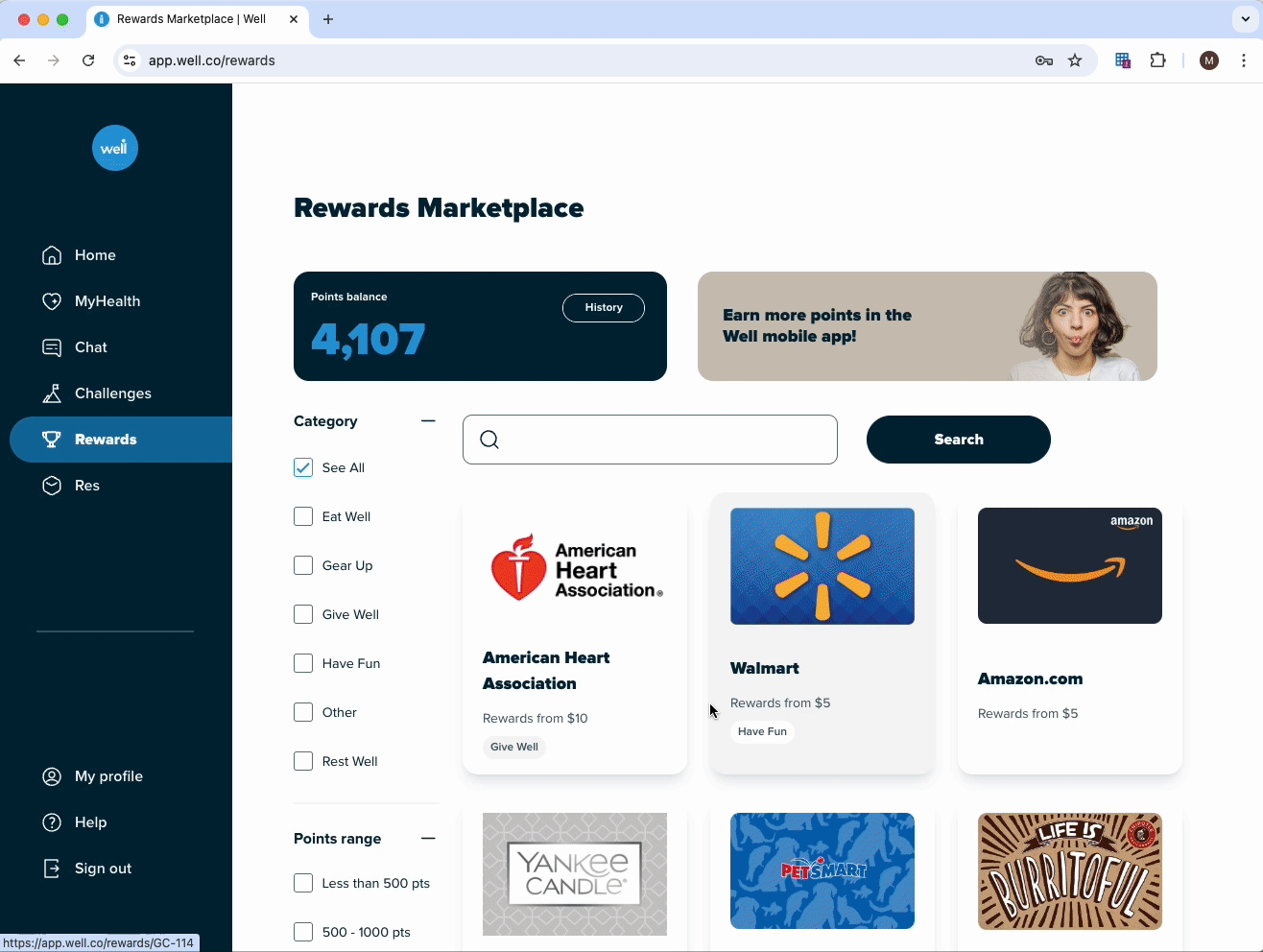
Redeem rewards points easily through a visually intuitive, user-centered rewards system.
🏆
Research
Due to an accelerated timeline, I leveraged existing user survey data from Well’s marketing team. A key insight emerged:

~50% of survey responders
Indicated they would have been more likely to sign up for Well if the offering was available via web instead of just a mobile app
Competitive landscape
Next, I analyzed competitors in the wellness industry, with a specific focus on mobile-first companies that had successfully transitioned to web.

Define
📊 Success measures
I presented my initial research findings to the Leadership Team at Well. From a business perspective, the addition of a web platform to the Well ecosystem should:
Increase Activation Rate (users signing up through web)
Decrease One-Time User Rate (users engaging beyond the first visit)
Increase Monthly Active Users Rate (users consistently returning to the platform)
Personas
To guide design decisions and help stakeholders across the organization empathize with the end user, and their needs and habits, I developed two key user personas

Christian
Marketing Manager (34 years old)
Works at his desk all day and prefers desktop access.
Hesitant to download mobile apps due to privacy concerns.
Wants to explore Well on web before committing to the mobile app.

Wendy
Human Resources Director (56 years old)
Not tech-savvy and does not own a smartphone.
Prefers simple, consistent access on desktop.
Needs clear guidance on rewards and wellness progress.
Ideation
Given our limited resources and tight timeline, we prioritized features that would deliver the highest impact with the least development effort for the Minimum Viable Product (MVP):
🔹 Unified Wellness Dashboard: A homepage offering a snapshot of health activities, progress on challenges, and available rewards.
🔹 Web-Friendly Rewards System: A visually appealing way for users to view, track, and redeem rewards points without the need for mobile.
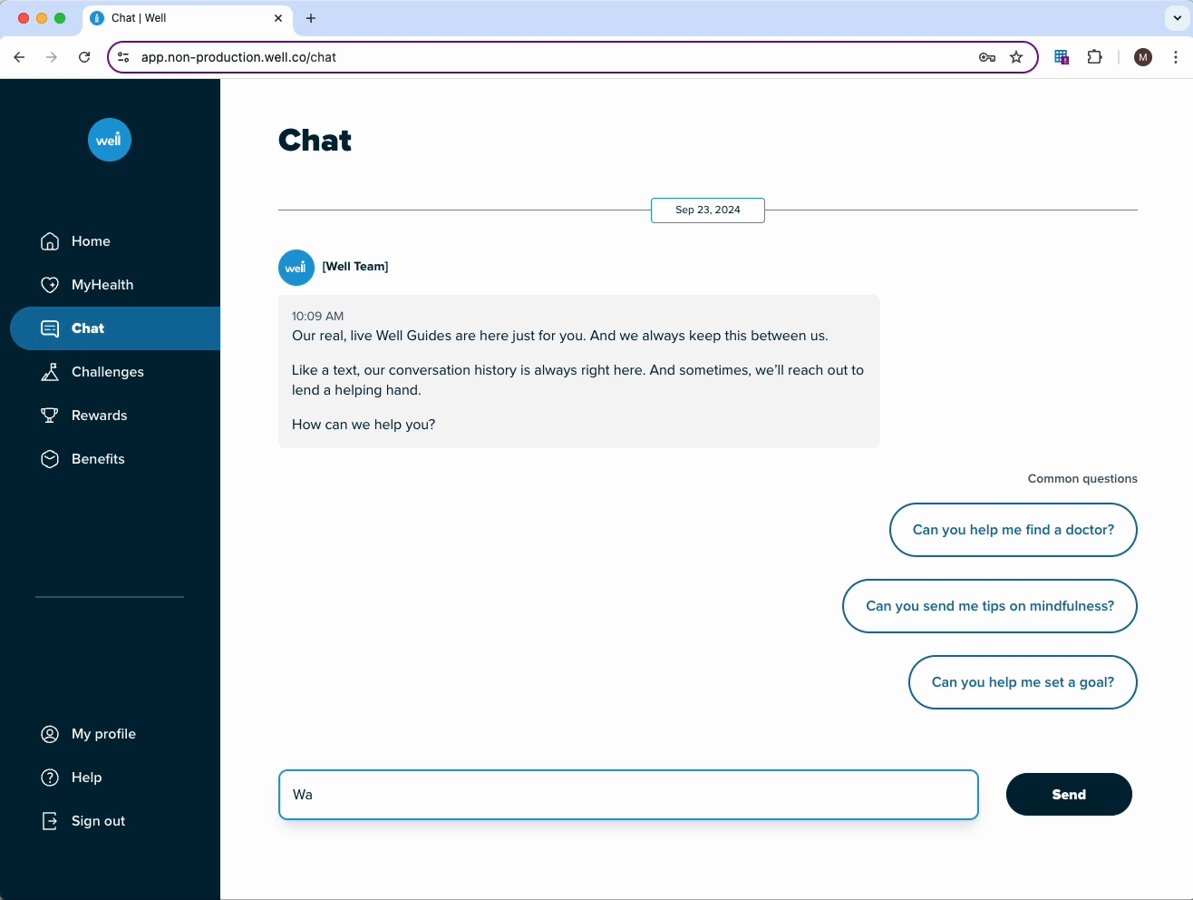
🔹 Integrated Well Guide Access: A dedicated area for users to connect with Well Guides through chat.

System architecture
Key path scenarios that gets our users to their most prominent use cases within the least amount of steps.
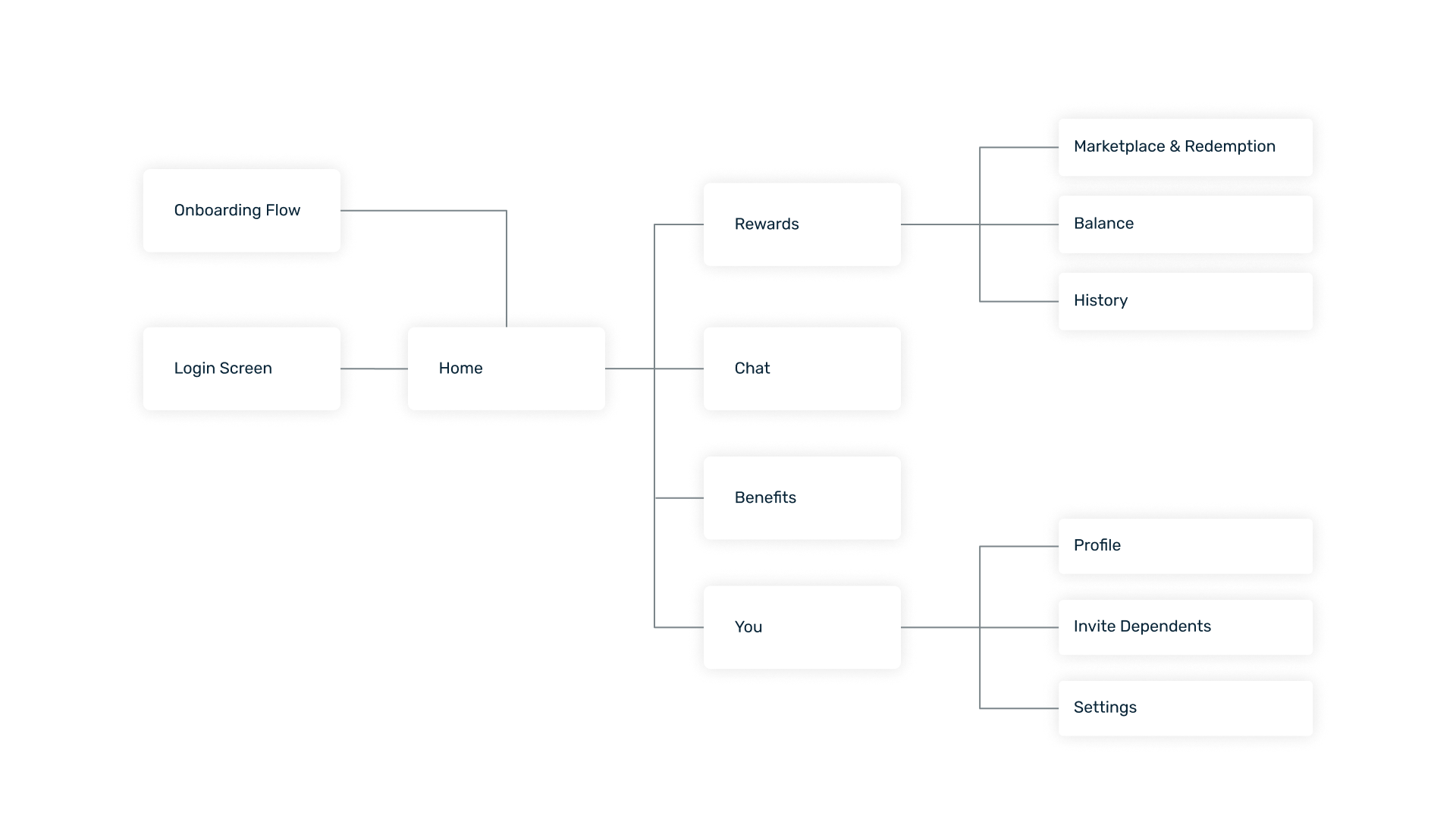
Wireframes
I received feedback from Well’s client representatives on my proposed sitemap and began creating wireframes.

Design
Building a web-specific style guide
To maintain consistency with Well’s branding while addressing the unique needs of a web-based platform, I developed a web-specific style guide as an extension of the mobile design system. This guide ensured that the web experience would align with Well’s identity while being optimized for desktop usability.

Another important attribute of the web platform was its responsiveness. In our efforts to reach as many potential new users as possible, we wanted the webpage to look good on varying device sizes. I created some spacing templates to ensure consistency.

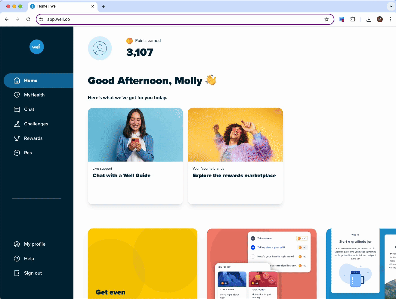
✨ High-fidelity designs
Once the new brand style guide was finished, the engineers had a working prototype of the web user experience. I then began to focus on the UI of the web platform and iterate on the feedback I received from my wireframes to create high-fidelity designs in Figma.

Test
To evaluate the MVP I conducted a moderated usability study of the Web app production site using dedicated tester accounts. The objective of the study was to understand user challenges and opportunities for improvement across key features: Chat with Well Guides, Rewards, and the onboarding experiences.
💡Key Insights:
Chat with Well Guides
Participants were confused about the role of Well Guides, often mistaking them for bots or basic customer support.
There was skepticism about their qualifications
Rewards System
Users were intrigued by the variety of rewards (e.g., gift cards and donations) but struggled to understand how to earn points.
Reward category names like "Gear Up" and "Eat Well" caused confusion, with participants finding them overly branded and unclear.
Web/Mobile Transition
Users were more likely to search for Well in their app store than use the provided QR code. This suggests a need to improve how web users are guided to the mobile app.
Analysis
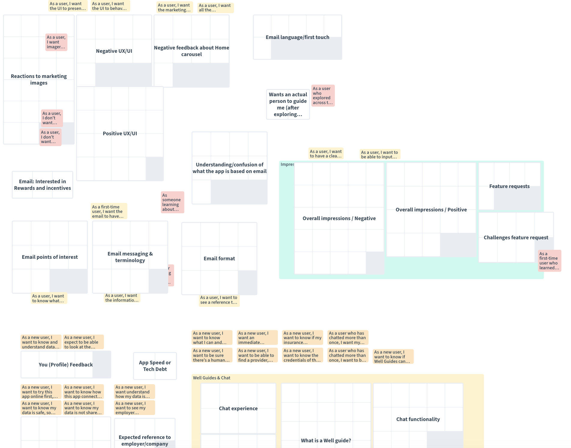
Using the data acquired from the usability test, I facilitated a brainstorming session with the rest of the design team and various roles around the company (including engineers, project managers, clinical writers, and marketers) in hopes of getting a diverse set of perspectives. We used Condens as our workspace for this workshop.
🧩 Affinity mapping
We began by grouping user quotes into categories to expose overarching themes and pain-points. From there, I had the group write out problem statements based on the these themes and dot vote to identify the ones we wanted to dive deeper into.
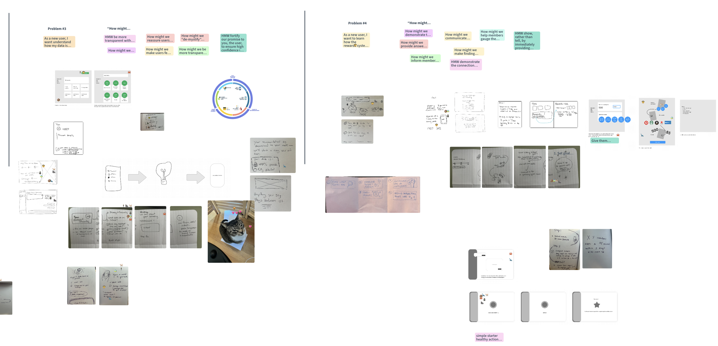
🔍 HMW statements and sketching


We selected the 4 problem statements with the most votes and broke into 4 groups to write How Might We questions. Each group then used the HMW statements to brainstorm and create rough sketch sketches of potential solutions.
Outcomes and opportunities
Launching the web MVP was a success! The impact was clear:
26% increase in user activations
from users who accessed Well exclusively on desktop.
14% increase in Monthly Active User Rate
as users were now able to access and redeem rewards more readily.
Positive client feedback
as Well met expectations for a desktop-accessible platform.
Actionable recommendations
Simplify Rewards: Provide explicit instructions for earning points and rename reward categories for better clarity.
💸
Guide to Mobile: Reassess the QR code strategy to better direct users from the web platform to the mobile app.
🗺️
Improve Onboarding Content: Streamline email and onboarding materials to emphasize the platform’s unique value in a concise, user-friendly manner.
🔦
Enhance the Chat Experience: Include transparent information about Well Guides’ qualifications and roles to build trust..
💬
✨ Reflection
Seeing thousands of new users onboard through the web platform was a proud moment. As the sole designer on this project, I learned to:
Make high-impact design decisions on tight timelines.
Balance user needs with business goals.
Advocate for UX improvements with measurable success metrics.